As consumers, we virtually never resist technology change that provides us with better products and services even when it costs jobs. Nor should we.
New York, New York

1 public comment

OK, but what about politics?
Toronto, ON
GEORGE: I can’t get it out of my head. I just keep singing it over and over. It just comes out. I have no control over it. I’m singing it on elevators, buses. I sing it in front of clients. It’s taking over my life.
JERRY: You know, Schumann went mad from that. He went crazy from one note. He couldn’t get it out of his head. I think it was an A. He kept repeating it over and over again. He had to be institutionalized.
GEORGE: Really? What if it doesn’t stop?
JERRY gestures “That’s the breaks.” – Seinfeld “The Jacket”
I won’t say that I present the picture of mental health or anything, but most people would be surprised to find out I harbor a habit that hints at deep insanity.
I listen to the same song over and over again. Alone in my office, or on my iPod, or on my phone, I play them on repeat over and over and over again. Loudly.
In my iTunes library there are certain songs of an embarrassing nature that I have played more than 300 or 400 times in a row (that is a full 24 hours each). I’ve gone through so many computers over the last few years that I don’t have an accurate tally, but if I were to add them up, the numbers and the songs would seem preposterous, even to me. They are my version of the backyard shed, covered in incomprehensible gibberish in A Beautiful Mind, or the wall in Carrie Mathison’s apartment after a manic fit. And then I wake from my stupor and discard the songs like used condoms and pretend it never happened.
As a result, I no longer enjoy “music,” a fact that the 16-year-old version of myself–the one who was in a band and had hard drives full of rare music–would have found unthinkable. God knows, I never thought I’d find myself 142 listens in on a Taylor Swift song on a Tuesday morning.
But there is a method to the madness. I found that this secret habit has been the fuel for my creative output.

See, part of writing–or really any creative endeavor from brainstorming to marketing–requires tuning everything out. There are a couple ways to do this. You have your noise canceling headphones or ambient noise machines. You can put your phone on “Airplane Mode” or tell everyone to leave you alone.
The problem with these reductive techniques is that they leave everything a little empty. In my experience, it’s not about quiet, it’s about finding your zone.
I think melodic music, played on repeat, puts you in a heightened emotional state–while simultaneously dulling your awareness to most of your surroundings. It puts you in a creative zone. The important facilities are turned on, while all the others are turned off.
Sometimes “good” songs can help you with that. But Bruce Springsteen only has so many songs that work for this (Try “I’m On Fire”). You exhaust them soon enough and have to start listening to songs on the Top 40. And you stop caring who wrote them–as long as it brings you closer to that state.
Michael Lewis (Liar’s Poker, The Blind Side, The Big Short) has spoken about this too. Writing a book–or really any major creative project–puts you in an “agitated mental state.” It’s hard to sleep, it’s hard to concentrate, it’s hard to be present in everyday. But you can’t afford that when you’re actually working. He fixes that by doing the following:
I pull down the blinds. I put my headset on and play the same soundtrack of twenty songs over and over and I don’t hear them. It shuts everything else out. So I don’t hear myself as I’m writing and laughing and talking to myself. I’m not even aware I’m making noise. I’m having a physical reaction to a very engaging experience. It is not a detached process.
You might ask, can you accomplish this by listening to music like a normal person? I would have thought so too, but the answer is no. Repeat on the same song or the same two or three songs allows the songs to fade into themselves–to become a more or less a continuous stream. The reason I gravitate towards radio singles is that they normally have big, catchy choruses. The idea is that after enough listens to song becomes a perpetual chorus.
Time stops. Distractions stop. Extraneous thinking stops. (Proof of which is the fact that you’re not bothered by the fact that the song is looping every three minutes and thirty seconds.)
All that’s left is the work at hand. All that’s left is that little voice inside your head that you’re attempting to hear and translate onto the page. All that’s left is the book or the paper you’re reading. All that’s left is problem you’re trying to crack when you go for a walk. All that’s left is the workout you’re trying to complete.
The bullshit–well, it disappears for a fleeting second.
Creative work isn’t about pleasure. It’s not always fun. It’s about reaching something inside yourself–something that society and everyday life make extraordinarily difficult. This is one way to do it.
The fact that it basically ruined music for me is a cost I am willing to pay. I’ll take my fix from anyone–and I’m not ashamed to say that I have. Even if that means I have to listen to the Black Eyed Peas or some other god-awful group.
Every writer (or painter or thinker or adman) finds their own way. This is mine. Maybe it will work for you. Or maybe you’ll try it and never look at me the same way again.
The post originally ran on ThoughtCatalog.com. Comments can be seen there.
New York, New York
Airbnb is currently offering a promo where, when you sign up for a new account and make your first booking before January 17 for travel between now and March 31, 2014, you get one night of a rental of two or more nights free up to $300 value. When booking, use the promo code ONENIGHT.
 Per the terms and conditions: The discount is valid only for guests who have never completed a booking on Airbnb. To receive the discount, you must book via the Airbnb website with promo code ONENIGHT and successfully complete Airbnb’s Verified ID process prior to booking. You must complete a booking (including host acceptance) using the code between 12:00am PST (California time) on January 13 and 11:59pm PST (California time) on January 17. The discount applies to one night of your stay up to a maximum of USD$300. The cost of “one night” is calculated by averaging the base reservation rate for each night, excluding taxes or other fees charged by your host, such as cleaning fees. Your stay must be at least two nights in length at the same listing, and must begin no later than 11:59pm PST (California time) on March 31, 2014. Limit one discount per new user. The offer is valid for a single use and is not transferrable to another user or redeemable for cash. If your booking later qualifies for a refund, the maximum refund you may receive is the amount you actually paid. The code cannot be used for bookings made through Airbnb’s mobile apps. The code may not be combined with another Airbnb coupon or discount code. Host payouts will not be affected by permissible guest use of the code. Airbnb reserves the right to any remedy, including denial of the discount or cancellation of your account or reservations, if fraud, tampering, violations of Airbnb’s Terms of Service or technical errors are suspected.
To use your promo code, select the property you want, then when your subtotal is added up, enter the code in the box that says COUPON CODE and click apply and your new subtotal should display.

Though I obviously focus mostly on hotel points programs when it comes to booking stays, Airbnb is a very useful site – especially because there are hundreds of thousands of listings all over the world in everything from shared rooms up to mansions in places where there might not be points hotels available. Or if you are traveling with a group, it can be more economical to rent a larger property that can accommodate you all rather than getting a ton of hotel rooms for several nights.
The payment method is secure and the site has a system of guarantees and insurance in place so both renters and landlords are protected. There is also a social community aspect to the site where users can rate each other and their stay experiences, which helps keep everyone honest.
You can pay for your Airbnb rental with a credit card, so you can earn points and miles as you usually would, but even better, Chase classifies Airbnb as a “Travel” merchant so you get 2.14X points per $1 when using your Sapphire Preferred card to pay. The Barclaycard Arrival also codes Airbnb as a “Travel” merchant, so not only do you earn 2X miles per $1 on your spending, even with the no-fee version of the card. It also means you can redeem your Arrival miles for the purchase as a statement credit at a rate of 1 cent per mile and get the 10% mileage refund for travel redemptions. So, if you were to use either version of the Arrival to pay for your Airbnb stay, you’d earn 2X miles. Then if you redeemed Arrival miles for the purchase, you’d basically be getting 2.2% cash back based on the fact that it’s a travel merchant – not a bad return on your spending.Obviously the way to maximize this promo is to book a two-night stay so that you are getting 50% off, or to book a property you were going to anyway that gets close to the $300 nightly rate so that free night maxes out the discount cap. If any of you take advantage of the promo, share your experiences in the comments below.
For more information, check out my post on Maximizing Points and Miles on Vacation Rentals with Airbnb and VRBO.
New York, New York
The compulsion to be free of a limb is no imaginary illness. Meet the man who spent his savings on an amputation — and the surgeon who helped him.
New York, New York

John Aldridge fell overboard in the middle of the night, 40 miles from shore, and the Coast Guard was looking in the wrong place. How did he survive?
New York, New York
Designers face some unique challenges when it comes to the creation of email signatures. In this article I share my experience over fourteen years and thousands of email signature designs. Following is my insight into how email signatures fail, and more importantly, how to push past their shortcomings to a successful design.
This article has a companion article in The Art of Designing and Marking Up Email Signatures.
Begin by Recalibrating Expectations
A great business email signature would:
- have visual pizzazz or classic styling;
- contain a wealth of pertinent information & hyperlinks without being overwhelming;
- while always functioning flawlessly.
Note that I said “would” and not “does.” Having dedicated myself to designing and developing email signatures for the past 14 years, I can state with authority that the above is not possible. With that out of the way, let’s start over.
A good business email signature is:
- visually appealing and reinforces branding;
- achieves a happy medium in terms of content & hyperlinks;
- functions as well as is possible and fails gracefully.
We’ve already made an important first step in the email signature design process – we’ve recalibrated expectations. Why is this necessary?
First of all, it just seems intuitive that creating a great email signature would be simple. Webpages can look beautiful and work flawlessly, even while incorporating complicated and diverse content. So an email signature, which is usually no more than contact information, a logo, and a few links, should pose no problem at all. Not true. We’ll come back to why shortly.
The second reason it’s necessary to begin by recalibrating expectations is that virtually everyone has received a beautifully designed email signature – an email signature that worked perfectly. Jumping to the (erroneous) conclusion that what they see is what everyone sees, this “perfect” email signature then sets the standard for the one they want for themselves.
The Problem is Easily Explained
Webpages display reliably because the only thing between the point of origin (the HTML code) and the destination (the webpage) is a browser. Displaying the webpage is the browser’s primary job, so it facilitates this simple transaction between author and reader almost perfectly.
Email is technically identical to a webpage – that is, it’s simply some HTML code that gets translated (by an email “client” program, not a browser) into something a person can read.
However, its “life” is frequently much more complicated than that of a webpage. It begins simply enough, the user composing a message using their email program (Outlook, iPhone, Gmail, etc.). The formatting of an email message, and signature, almost always starts out perfect. The next step though, is that it’s received by someone who:
- may be using a computer or may be using a phone;
- may receive email in Outlook, Gmail, iOS, Android, Yahoo, BlackBerry or something else;
- may have image blocking turned on (and if so, may or may not choose to display the images);
- may convert all received email into plain text.
They then may reply or forward. In so doing, the settings and capabilities of whatever email program / device they are using apply to the whole message, not just to the new content they’ve added. The whole message includes the original email signature. Depending upon the combination of the above listed factors, the email signature may survive intact or may degrade (fail) in various ways. The following chart shows some of the most common situations:
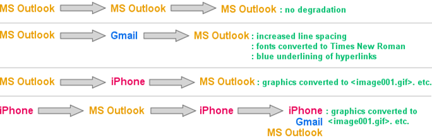
Understanding that failure will occur along these lines is key to the next step in effective email signature design, the compromise.
The Compromise
Given that email signatures do not work as well as we’d like, we need to settle for something less than perfect. The spectrum of choices ranges from brief text to graphically rich signatures loaded with hyperlinks. As is true of most things in life, a happy medium lies somewhere in- between.
As I’ve observed over the years, when the proper happy-medium is achieved, users settle in comfortably. Identifying where on the spectrum this happy-medium lies takes experience, good honest communications with the customer, and occasionally some trial and error.

As a rule-of-thumb, professionals (attorneys, CPAs, engineers, etc.) tend left of center of the spectrum shown above, while sales people (real estate, mortgage lenders, insurance), tend further to the right.
There is no right or wrong. With the signature on the left, Emily will experience a high degree of reliability. Almost every time she sees her signature, including in email threads that have gone back and forth a bunch of times, her signature’s going to look about the same. Any anxiety Emily feels in regards to her signature is likely to come when she is exposed to a full-featured, graphically rich, signature and is left to wonder if she’s missing something.
On the other hand, if Emily’s using the signature on the right, she’s likely to frequently see this:

This experience can create the opposite type of anxiety – leaving her wondering if maybe she hasn’t gotten too fancy and is now creating an unprofessional impression.
Over the years I’ve created all types of signatures for people, helped people move back and forth across this spectrum, and watched as they finally get settled and comfortable with a signature that is always a bit less than perfect.
Note: For a person like Emily, using the signature shown above with all of the <image00x .gif>s, it’s critical for her to understand that the person she emailed most likely saw the signature as intended. Only when that person clicked REPLY did things get messed up. This is the truth, and is also a very important point in helping new users get comfortable with the performance of their signatures.
Achieving the Compromise – Your Toolkit
Because of the likelihood that the user (your customer) will not have an in-depth grasp of the issues surrounding the use of their email signature, one of your jobs as a designer is to guide them down the most prudent path during the design phase. Where they may see nothing but colorful images, precision alignment, and numerous hyperlinks, you may be seeing ahead to the pending headache of explaining to them why it’s not working exactly as they wanted it to.
From a reliability standpoint, your primary enemy is graphics. Lesser enemies are hyperlinks and text strings that can wrap badly.
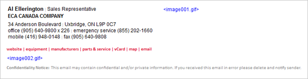
Dialing back on the use of graphics can, at times, be accomplished with minimal impact on the visual quality of the signature. Here’s a recent situation I dealt with. The full design the client specified was:

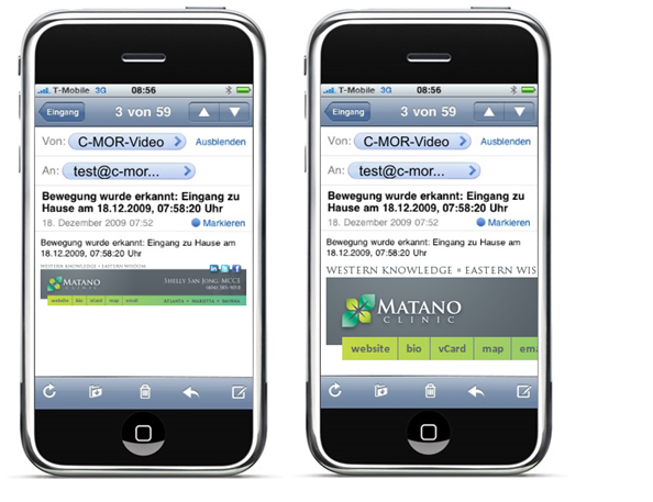
Each of the little logos in the row at the bottom was individually hyperlinked, all going to a specific manufacturer page on the ECA website. When this email signature traveled from MS Outlook to iPhones and back, the result was:

Responding to the customer concern, I improved this by grouping the ten logo graphics into one graphic:

Following this improvement, the resulting degraded signature appeared as:
As you can see, the failure above is more gracefully presented than the one with eleven </image00x><image00x .gif>s. In this case I was able to link to a manufacturer’s page which was a jumping off point for all ten of the individual manufacturers, so we lost nothing visually and very little functionally, making this a good step towards the happy medium for this user.
To illustrate a different approach, let’s return to the Recruiters International signature for Emily Fitzpatrick. As you recall, she had eight social media (type) icons at the bottom of her signature:

As a result of all the graphics (logo and many icons), her signature looked as follows after making the roundtrip from Outlook through an iPhone and back:

In this case, we were able to clean it up significantly by changing the icons to text. The look of the intact signature then became:

As a result of this adjustment, her signature now looked as follows after making the roundtrip from Outlook through an iPhone and back:

Now, this may or may not have been the happy medium for Emily – it really depends upon how wedded she was to those social media icons. At least I was able to offer her options, allowing her to be the final arbiter.
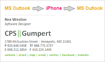
Next let’s take this drive towards greater reliability a step further. Sometimes it’s possible to create a good reproduction of a company’s logo by using stylized HTML text. Here’s an example of a signature I designed recently that had four graphics – the company logo and three social media icons:

After this was put in use, the customer indicated that a few users were experiencing a considerable degree of consternation over the behavior of the graphics, and would it be possible to reconstruct the signature with no graphics at all. The resulting text-only signature was:

At this point we have a signature that is going to present minimal changes as it travels from email program to email program.
Back-and-forth between MS Outlook and iPhone / iPad results in no degradation.
Gmail changes the font styling to Times New Roman and collapses the two vertical green bars into one.
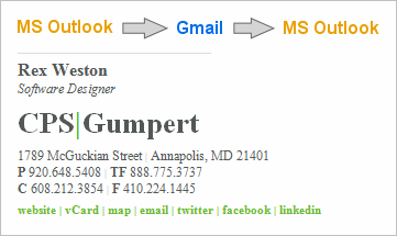
Note on Line Spacing (Leading): Many normal HTML styling tricks are unavailable to you when designing email signatures. One of these is an ability to reliably create reduced line heights. As a result, a reliable text-based recreation of a stacked logo that utilizes tight leading is not possible.

In this section I’ve covered the process of stepping backwards across the performance / design spectrum. Understanding the tools that are at your disposal, and the gains and sacrifices made by various choices, puts you in a better position to commence the design phase of your project – the goal being to present the customer with a design that satisfies them when first seen, and then continues to satisfy them when in actual use.
Forward Looking Design & Layout
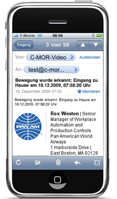
One trap that’s important to avoid is the creation of a design that cannot handle abnormally long strings of text. This is most common when it comes to titles. You may anticipate a title such as “Vice President of Administration” but not be prepared for “Senior Manager of Workplace Automation and Production Controls”. The graphic below is an illustration of a design concept that could suffer from this problem.

Sometimes the most practical solution is to deal with the handful of anomalies (long names or titles) on a custom basis, in the case above perhaps manually widening the design in the few cases where it’s necessary.
Smartphones present the greatest design problems these days. First and foremost is text wrapping. A linear presentation of phone numbers and addresses is often preferable from a design standpoint:
1800 East Washington Avenue, New Lisbon, WI 53303
Tel: (608) 233-3100 | Mobile: (608) 845-8333 | Fax: (608) 233-3199
However, the wrapping on a smartphone may cause this to be displayed as:
1800 East Washington Avenue, New
Lisbon, WI 53303
Tel: (608) 233-3100 | Mobile: (608)
845-8333 | Fax: (608) 233-3199
It’s useful to note that expectations seem to be low for the display of signatures on smartphones – most people recognize that the screens are small with the result being that perfect formatting may suffer. However, if the above wrapping proves to be unacceptable to the customer, the obvious solution is to move to a stacked design:
1800 East Washington Avenue
New Lisbon, WI 53303
Tel: (608) 233-3100
Mobile: (608) 845-8333
Fax: (608) 233-3199
It is also important to think about the width of any graphics you may use, and if overly wide, how they may translate to display on a smartphone. Below is a graphically based signature design I did for a customer a number of years ago.

There are two ways, both bad, that this may be displayed on a smartphone. As seen on the left below, it can be scaled down to fit the window. In this case, the text in the signature becomes completely unreadable, making it impossible to even read the sender’s name. (I have seen cases where the message text itself is also shrunk at the same proportion as the signature graphic, making the entire message unreadable). The illustration on the right shows the alternative condition – the signature graphic is displayed full size, cutting off the vast majority of it.
In designing email signatures these days we must assume that they will be received on smartphones. As a result it is important to do your best to keep graphics to a reasonable width (a 300px maximum is a good rule-of-thumb).
It’s also important to remember how table layouts can limit available display space on smartphones. From a design standpoint, I tend to favor what I call a “side-by-side” design when confronted with a square, round, or vertically oriented logo. Here’s an example:

Note, however, the problem we encounter when displaying this on a smartphone:
As you can see, design becomes quite difficult when considering the various constraints. The optimal layout is a simple stacked design, with nothing wide enough to trigger wrapping on a smartphone. The simple email signature below on the left will produce the result shown on the right when displayed on a smartphone:
Although this can feel very limiting, I’ve found that it’s almost always possible to find a compromise design that the customer is comfortable with. Sometimes, unfortunately, this is a multi-step process, as it’s often the case that customers only become truly aware of the technical limitations once they put their email signature into actual day-to-day use.
Content Considerations
There’s a great deal that’s been written about what content belongs in an email signature, and what doesn’t. Although I’ve designed literally thousands of signatures, I don’t have a strong opinion as to what should be included – I think that the content decision is very customer specific. That said, here are a few experience-based observations:
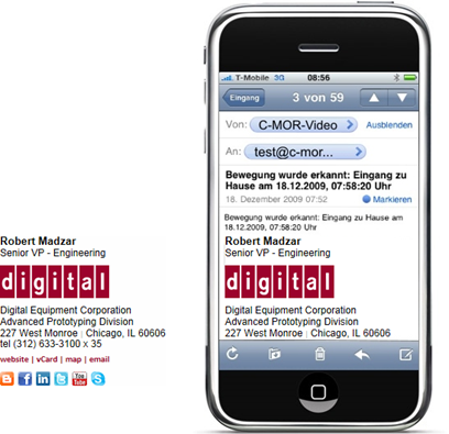
Photos: Realtors & Mortgage Loan Officers often like photos of themselves:

Links to Bio Pages: Whenever bio pages for individuals are included on a website – attorneys almost always – then the email signature should include a hyperlink to the bio page. Email signatures provide a natural feeder into the more detailed bio page, allowing the sender to feel confident that he or she is sharing information about themselves in an effective and efficient manner.
Taglines: In some cases the addition of a company tagline is desired – I usually add them at the bottom of the signature, using a colored font if appropriate, such as I did here with the “We Build Trust, Teams & Integrity”

Page-Specific Hyperlinks: Some customers have very specific items on their website that they want to call people’s attention to. If this is the case, it may be appropriate to add these as page-specific links in the email signature itself, as we did here with “see a demo”, “buyer’s guide” and resource center”.

User Optional Content: One of the things that can make email signature design a challenge is the variations between users. Some may want to include their mobile phone number, some may prefer not to use their title, some may work out of a home office and hence not want to include a physical address, etc. Furthermore, email signatures are quite personal. The more latitude you give to users to customize their signature (within set boundaries) the more likely your program roll-out and adoption process will go smoothly. I often make social media links optional, always make mobile phone numbers optional, and sometimes make other data elements like a toll free number, a tagline, or page-specific hyperlinks optional.
Conclusion
Here’s how I approach virtually every new email signature project:
- Present the customer with a middle-of-the-road design that I feel confident will work well.
- At the same time I present this to them I inform them that it will not work perfectly, and let them know about some of the problems they can expect. I usually do this by directing them to our FAQs – http://www.digitechbranding.com/pages/email-signature-user-FAQs.html.
FAQ’s – http://www.digitechbranding.com/pages/email-signature-user-FAQs.html.My feeling is that three things are accomplished by the simultaneous presentation of a design and its technical pitfalls – you nip their desire for something even fancier and more elaborate in the bud, you begin lowering their expectations to a reasonable level, and you establish yourself as someone who is going to be honest and straight-forward with them. - If they don’t abandon the project (or you) at this point, you’re now in a good position to work with them and achieve a good result based on realistic expectations.
The companion article I’ve written, “The Art of Designing and Marking Up Email Signatures” will give you the detailed information you need in order to construct sound HTML code for an email signature, and then some helpful strategies for deploying the finished program.
Good luck – there’s a lot of satisfaction to be had in doing an email signature project well.
The post Email Signature Design, Layout and Content appeared first on SitePoint.
New York, New York
Next Page of Stories